22 May 2013

What's True on the Ground...

...is equally true in the air.

Walking Crocker-Amazon this windy morning, my wife and I noticed the sky was crossed by a number of long, thin clouds. The whole group of them must have been a few miles wide and many miles deep. When I told my non-artist wife that the clouds were in fact parallel, I blew her mind, man.  By which I mean, she thought I was full of shit.

But then I got her to think of a huge railyard with the tracks running toward her. "They would look fanned-out too, even though they're really parallel."

At this point, she conceded, yielding to my mighty powers of suggestion. I bet you're thinking of a huge railyard right now. Last night's clam spaghetti? Summer vacation. Someone whose name starts with B?

JH

27 July 2012

3 Point Poser

You're familiar with how, in a strong upshot or downshot, the verticals of buildings "fan out" or converge, rather than being parallel. We see this in 3-point and 2-point-vertical views, as well as fisheye. Those verticals converge upon the VP that we're most nearly looking at, and widen on the opposite end of the picture. You can see this effect dynamically by panning around within Street View in Google Maps or Google Earth: One end of the picture squishes and one broadens as we mouse to and fro, the squishing happening where a VP comes near our frame of view.

So why is the opposite happening in this picture, made long before Photoshop made such distortions easy? The horizon isn't high in the frame (the view seems almost as much upshot as downshot) and the buildings and cable car which we are necessarily looking up at--given their appearing above the horizon--broaden at the top like thunderclouds. Weird, right?
Archives San Francisco Chronicle

Shouldn't those verticals be, if anything, leaning in toward the top?

I have two hypotheses, one simple, one conjectural:

One

I think what happened here was that the photog shot with a short (wide-angle) lens aimed down, putting his center of vision on the ground, not among the Santas' bellies but their boots. Then the bottom of the picture was cropped off. Just that simple. The horizon was in fact high in the frame, but the crop conceals that.

BTW, we don't see things like this this thunderhead effect happening with our eyes, because our peripheral vision is weak and lacks detail.

But in cameras the image receiving surface (where film once lay) is flat. So whatever perspective logic is dictated by the lens setup -- in relation to the physical scene -- prevails over the whole flat receiving surface. Point a wide-angle camera at the ground a few feet away, and the verticals converge toward the bottom and widen at the top, consistently, mathematically. There is in this case no muting of the effect: no fisheye to curve the straight lines, or imperfect spherical retina to lose details. The resulting perspective prevails both above and below the horizon, as all perspective does. That basic fact is one of the first things beginning students either grasp, or get caught up short on.

Two

2A

The second hypothesis is worthy mostly just because it leads to a movie that feels like a tiny tropical vacation (You'll see.), but I advance it seriously:

It is that some cameras allow the user to tip the receiving surface. That could create this thunderhead effect. If the surface was tipped to make the image of the building tops have to travel a tiny bit farther in the camera's inner space, they would spread bigger.

2B


The same could be accomplished with the now-quaint optical print-making device known as the enlarger. The challenge in either method would be to not have major parts of the image go out of focus. This could probably be managed by using smaller aperture and longer exposure.

The thunderhead effect may have been in vogue in news photography, c. late 60s -70s - ? Yes, to judge by the collection of vintage SF Chronicle cable-cars photos I got this from, which contained at least one other example of similarly counter-logical perspective. Shooting this way adds jazzy, energizing diagonals, something I'm forever telling comics students and myself to do, to avoid dull drawings.

So how do I know that tipping that receiving surface risks out-of-focus results? Because that very adaptation, called tilt shift, can be used to create an artificially abbreviated depth of field. This is one of the several tricks used to accomplish this bizarre and utterly singular effect (see below), which you may also have seen in insurance commercials on TV. The other tricks are heightened color saturation and sped-up motion. Uncanny how they combine to create a world that looks real and toy at the same time, isn't it?

JH


07 February 2012

Mod 2 -- I guess you had to be there-- and I mean right there.

I was walking through my unglamorous corner of San Francisco and saw this sight:

Unremarkable, right? Maybe at first and second glance. But it reminded me of a mistake that beginning students often make with cast shadows: Having the shadow take on a simple shape, like this triangle, that falls onto the ground intact without respect to any incidental objects it may hit, such as the weeds. As in this D-winning student work, where the (totally unrealistic) shape of the cast shadow just powers through the second flower pot as if it wasn't really there, or...

...was flat artwork like this trompe l'oeil chalk art.

So how could this be happening in real life? How could the shadow just act as if the weeds weren't there? The short answer is that it was totally dependent on my having a particular position, and thus a particular line of sight. Similar to the way that this sidewalk art...

...only looks right from one precise position in space. (The very same position where last night the cunning chalk artist set up a projector on a tripod to show him exactly what to draw.)


The shorter lesson of this is: distrust a shadow that's a simpler shape than the object what done made it.

The more involved answer is that I happened to be standing where two shadow-edges with two totally different directions appeared continuous. I'm betting it could only be seen thus from that one position, among the infinite others possible.

The weeds, by being very robustly 3D and--with their fine leaves--effectively semi-transparent, were showing me something that you don't normally see except in fog or airborne dust: the passage of a cast shadow through 3D space. I just happened to be standing where the sloping plane of the tent-like volume of the cast shadow falling through the weeds was (1) raked by my eyeline, (2) was foreshortened from my end-on vantage point as to appear to be a line and not a plane, and (3) just happened to appear continuous with the edge of the cast shadow of the old house's gutter on the sidewalk, despite being at a radically different angle in space.

Just a step and a half to the left, and the view was quite different, and befit the real complexity of the situation:

JH


P.S.: If you are really into this kind of thing, you will understand why the sloping sidewalk was necessary for the creation of that first scene above: The slope disrupted the normal parallel relationship that the gutter and its shadow would have on level ground.

19 January 2012

Welcome to Spring!

Dear ILL625 Spring '11 Students,
Please check out this video, which may help mentally prepare you for this class. Here's wishing everybody a great semester!
(BTW If you chance to look at older blog entries, you will find different and more involved terminology than we're using now, which may or may not be helpful to you.)

JH
05 September 2011

Shadow Plotting and "The Law of Parallels"

For Assignment #2, I explain basic shadow plotting, and go over the Parallels concept that so much of Module 2 is about. Here, with the addition of a little jargon (sorry), I try to make clear when Parallels happen and when they don't, and then look at the practical application of the idea from the perspective of an artist as opposed to a viewer of photos.

None of this adds any new insight or concept on top of what's in the modules, but may help those who aren't quite getting on top of the ideas there.


JH

04 July 2011

Sharing the "Wealth"

Here are some materials I did up for one of my directed study students today. She is someone who is already unusually aware of the little offsets and foreshortenings that make a face work in 3/4 view. The points made in these jpegs were offered as refinements upon that foundation.

Longtime friends and students may notice that one of these continues my almost-unhealthy preoccupation with eyebrows as indicators of dimensionality or, conversely, unsophisticated drawing.

(I am all about the sophistication, as you can tell by this grotesque kid in particular.)


JH
These are Copyright 2011 Academy of Art.


05 June 2011

Thanks, Friday Class!

Dax mailed me the colorful and cheerful bag of good wishes you guys sent me. Thanks for the nice card and the clever puzzle, you guys. The latter will be a test of my awareness of the fine points of shape! My recovery continues well, no doubt thanks in part to all the kind thoughts and prayers sent my way. I'm expecting to teach at least one class in summer semester.
Thanks, you guys; you really made me feel cared for.
JH

23 May 2011

My Surgery

My cancer surgery of last week went well. The surgeon, Mark Singer, is a very preeminent, highly skilled guy who also is a very good-humored and reassuring--not that common a combination, I'm told and I believe it.

It's a good thing this is basically happening between  semesters. I look scary now and my voice is shot. But the body, even the post-middle-age body, is an incredible thing.

I want to thank everybody who shook my hand or sent me an encouraging message through email or Facebook.  There's never any need to feel called upon to say something special in such a case; I can tell you every expression of good wishes is gratefully banked and adds to the strength I can bring to bear in the situation.

(But when a friend quoted a line from an old Simpsons episode to me, "Chicks dig scars," that was kind of extra bonus special. :)  )

JH

18 May 2011

Thanks, you guys

Thanks to you guys (and other friends and family), I feel I'm floating into surgery tomorrow on a tide of goodwill.  That has got to help my chances (which I believe are pretty good)! Thanks so much for the words of encouragement, handshakes, prayers and positivity, you guys. I was happily stunned by the origami good-luck token you Tuesday folks made with Keiko. That was deeply touching--I thought I was gonna lose it for a second.

JH


10 May 2011

For the Children's Book Illustrators among You.

Now the mere thought of someone telling me my drawings didn't capture the special magic of her stinky basset hound would make me murderous, so I guess I couldn't be a children's book artist for hire. But you may enjoy this story of the process of making one children's book.

My friend says this woman's site, which is mostly about recipes I guess, has a million dollars in sales a year and she is a bestselling cookbook author... Which may help explain how she got a contract for the book before she'd even written it.

JH

For Final Fisheye Fans

For any of you who might like to incorporate fisheye into your finals, here is a link to my other blog, where you will find the grids you need.
JH

24 April 2011

Reflection

Here's a slight variation of the method I demo-ed in class.

JH

19 April 2011

Feeling Reflective?

Aside from being boring, and wretchedly "scanned," can you see what's wrong with this C- one?

D. A similar error compounded by wildly incorrect perspective

A! Excellent is as excellence does.

A!

A-, despite terribly unrealistic face and lack of complete BG reflection. Everything else is essentially perfect
ASS #11

Description

    Create an illustration for the story of Snow White. Research and design your characters and locations to fit the country/era in which you decide to set the story.

    Your style must be 100% literal/realistic.

    Illustrate the passage below using the 2-point perspective mirror construction you learned in class. We should see both the Queen and her environment reflected accurately in the mirror.

    She must be shown from head to toe - and at least three other items must be seen in the room as well as reflected in the mirror. Don't forget: this illustration must show as much accurate reflection of objects as possible and will be graded accordingly.

    Don't skip drawing the reflection of the walls of the room. I can't tell you how many drawings I've seen where the queen and the three objects were reflected, but nothing else, as if there were a low-hanging fog in the room.

    Important Tip: Use the whole wall as the mirror until you get your reflections in place, then decide where to place the mirror frame to fit with your reflection.

(Also, rather than placing objects in the “real world” in the hopes that they will appear where you want in “Mirrorworld,” it’s easier to  place them in Mirrorworld first and then use the usual process in the opposite direction to place them into the real world. This tip from Joko.)

    Your line drawing should be 9" x 12" or larger at the same proportion. Keep it neat, clean, realistic and accurate. Your default line should be a single clean line. Contours should be weighted only if you can do it smoothly, without hairiness. Straight edges should be straight. Ensure that this drawing is as professional and precise as you are capable of producing. Add no value at this time.

    INCLUDE A CLEAR OVERLAY SHOWING YOUR CONSTRUCTIONS. Flap it properly, with a long piece of tape across the back.

Snow White Text

        News of Snow White's death sent the Queen rushing to consult her magic mirror. She fled to the top of the tallest tower and entered the secret chamber where all her terrible spells were boiled and bred.

        Lighting a candle she locked the chamber door and turned to question the mirror that watched her silently from the far wall.

        'Mirror, Mirror on the wall, who is the fairest of them all?'

        There was a long silence as her reflection scowled back at her from within the glass.

        Then, finally, the mirror spoke...


    Here is a schematic that covers the main reflection schemes. For simplicity, not every point has its reflection plotted. This is made to demonstrate the appropriate use of the subdivision method in various situations. Note please that in cases such as points E, F and G, where the object is not using the same VPs as the mirror, each corner must be plotted independently.
    And here is a way of checking your work as you go to eliminate the little inaccuracies that the above methods amplify. You may prefer the animated version, here. (Wait for a second--the animation gives you a chance to study the setup.) The key insight here is the projection lines meeting their own reflections at the foot of the mirror plane. That will help you draw the reflection more accurately. You can go beyond that in some cases and find a Mirrorworld VP or two, which will really make your drawing hang together.


JH

12 April 2011

Assignment #10


REMINDERS: 
Contact me anytime for an update on your grade.


TODAY'S TOPIC :
Environments for Your Clothed Figure 


Homework #10
Continue with your line drawing from last week by putting your characters into a convincing, non-fantastic man-made environment that fits both thematically and perceptively.
Use the methods discussed in class to ensure that all elements stay in proportion and in perspective with each other. Be sure the horizon coincides with that used to draw your characters. 
Remember that receding planes should appear shorter than those that face you, much shorter close to VP.
Make your environment realistic, interesting, and detailed. Observe the finer points of doors, windows, furniture - whatever you choose to include in our piece. If you are unsure of the exactly design of an object feel free to gain reference and use it, however it is not permitted to copy/trace an environment.

INCLUDE A FLOOR, CEILING OR WALL THAT'S TILED IN SQUARE TILES, so that I can see you know how to use a DVP, or measuring points.
Try to have a foreground and middle ground and background to your scene. Consider introducing elements that overlap your fighting characters to involve them more in their environment. Include organic and geometric shapes, which will add variety and hopefully avoid the 'perspective drawing' look. Use more than one form of perspective (one - and two-point for example). This will make your environment appear less deliberate.
Your drawing should be neat, clean and accurate. Your default line for edges should be a single line--not a hairy, back-and-forth one; though you may add weight to contour lines, which I don't feel harms the realism. Straight edges should be straight. Ensure that this drawing is as professional and precise as you are capable of producing. 

JH

08 April 2011

ILLUSTRATION CONTEST!

Chuck Pyle sent this one along. Could be a nice opportunity...
LINK

JH

03 April 2011

Homework #9

Thanks to the affable and prodigiously talented Mark Simmons for subbing for me this Tuesday.
Your assignment is to read the rest of the text and to follow the instructions set forth here.
Don't forget that everyone in the department would love to see your B+ or better work in the Spring show (entry forms now available in the first floor hallway) and likewise remember the Comic Book Club meetings at 6:30 pm Wednesdays on the first floor! See you soon--I've got a big freelance job this week.
++++++

Homework 9
Read the rest of the text and...
   
Clothe the fighting figures from last week. You may use tracing paper to draw over last week's drawing, then photocopy the finished result, or better yet composite in Photoshop. This drawing should be roughly 10" x 10", neat, with strong simple contour lines.
Visualize where the compression (bunching/crushing) and extension (stretching) of fabric will take place due to a body position/movement. Look for compressions on the reverse side of extensions and folds that follow the direction of movement.
Compressions at elbows, hips, knees etc. should wrap around the form of the joint, not appear to run straight.
Imagine the quantity of fabric that will bunch in a certain situation remembering the tightness and weight of the material. (Thick material has heavier, larger and softer folds than thin. Supple fabric such as satin hangs heavier, more vertically.)
Use the hems of sleeves, pants, necklines, belts etc. to act as ellipses. These will help describe the angle of the body-parts they enclose. (narrow ellipses are seen more from the side than open ones)
Loose fabric (scarves, skirts, shawls etc.) may be used to show movement: flying out behind the moving object. The weight and quantity of the fabric, combined with the force of the movement, will decide the extent of such a incident.
Each character should be wearing a regularly patterned shirt, skirt, dress or pants: stripes, checks, polka dots etc. Make sure this pattern wraps convincingly around the form of the body, foreshortening as the surface turns away from our eye.        


Timeless material on hands, feet, dress shoes here.
Plus more relevant stuff below.


JH


29 March 2011

Past examples of Assignment 8

A


C

D


Assignment #8

Real
Ideal ;)

TODAY'S TOPIC :
Clothing the figure

IN-CLASS EXERCISE: Drawing folds from magazine ads


Homework #8 -- Combat! Part 1

    •    Read all or most of the Text
    •    Complete 1 line drawing in good proportion.

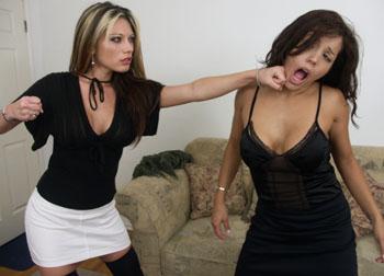
Your drawing must show two people in hand-to-hand combat. Your characters may be engaged in a fist fight, a play fight, brawl or wrestling match. There should be no weapons involved. Poses should feel authentic and have movement. Identify the general thrust/direction line to your attacking and defensive poses.
Your characters should be drawn without clothes.
You may use reference as inspiration for the pose you choose but make your drawing in different perspective from your source.

This drawing should be roughly 10" x 10", neat with, strong simple contour lines.
Take the time you need to perfect the anatomy, proportion and foreshortening of various body parts. When finished, set your drawing aside and reassess it the next day.

More pix and detail in this earlier version of this post. But getting your own additional ref is highly recommended.
JH

22 March 2011

Assignment #7


Keiko reminded me that I had promised to post examples of past work on this assignment --here are some good ones. They could perhaps have been improved by projecting the width of the head down to the floors of the boxes to check that the feet weren't too big. Also in the walking ones, the feet could have been placed under the center of gravity a tad better.

JH